My inspiration right now? This. I'm so happy I discovered Emily Henderson and her blog. Pushing limits in design is important and I think she does just that.
 |
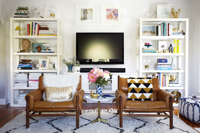
| Emily Henderson's living room |
 |
 |
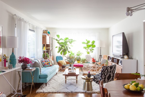
| Bri Emery's living room, designed by Emily Henderson |
I mean can we just take a second to take in these masterpieces.
Instead of just saying "I like this", I want to point out the details that really make these rooms so perfect.
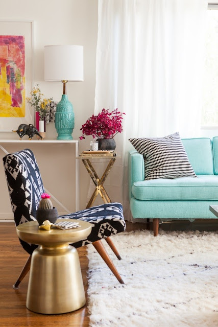
1. The rug. It's from West Elm and it's used in both spaces. It's texture and neutral color play up the space just enough to make it interesting. I loved it so much I bought my own (cheaper) version of the rug for my apartment. More on that in my apartment reveal :)
2. Midcentury furniture. Notice the coffee table and sofa in each living room. The peg legs are what make it midcentury.
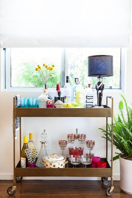
3. Unique use of accessories. One of my favorite accessories in the entire collection are the arrows on the mantel in the second image. The simplicity of taking something that was not initially designed for decoration and making it work is completely cool.
4. Pops of color. Different forms of color are found throughout both living rooms, yet it doesn't feel overdone. The turquoise couch for example. She ties it in completely with wall art, lamps, pillows and the key, a neutral rug.
5. Personality. I don't know about you, but every time I see a room straight from a catalog I cringe a little. Everyone has their own taste, but a room doesn't feel like yours unless it has pieces that make it yours. Fun accessories and a little mixing with furniture helps create that finished, not too perfect look with your own touch.
Happy Friday!
All images via and via


No comments:
Post a Comment